
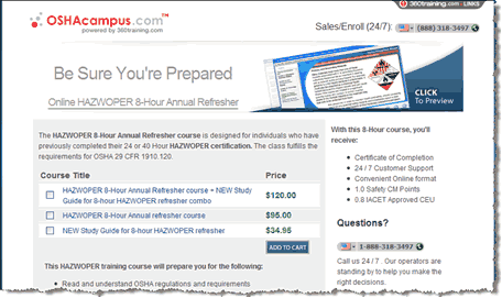
Analysis (Aaron Rosenthal)
- If eight hours is particularly fast, compared to say, 40 hours, to get your certification, then reinforce that and use language like, “half the time” or “one–third the time” with fractions or percentages to drive the point home.
- Also, if this is an optional course, the headline needs to do a better job of pointing out the benefits of getting your certification again. If the course is mandatory, it should do a better job of communicating the difference in getting the certification from you as opposed to another provider.
Analysis (Hunter Boyle)
- The headline, “Be Sure You’re Prepared” has a sense of urgency and implies a benefit, but it could be more specific. Depending on the audience’s highest priorities, you might test language like, “Be Ready For _______” and fill in the blank with top–performing PPC keywords that drive traffic to the page.
- You might also test variations such as a shorter, bare–bones headline (Stay Prepared), against a question (Are You Prepared?), or reduce the image on the right and test a longer headline (5 Reasons To Refresh Your HAZWOPER Certification With Us).
Landing Page 2: Smith Mountain Lake
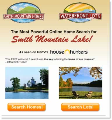
Analysis (Jimmy Ellis)
- I don’t know what the benefit of using this search is compared to anyone else’s, so there’s a lack of credibility.
- The headline states, “The most powerful” – but you have to quantify that if you possibly can, like how many homes or other details that differentiate this search.
- Looking at the total design, to convince people that they should use this search versus another one, you want to just cut the extra steps and get them searching before trying to convince them of something.
Analysis (Hunter Boyle)
- From a design standpoint, we’ve done a lot of research that shows the problems with using competing objectives with equal weight. This page splits right down the middle, from the two logos to the photos and search buttons that are the same color and size. Emphasize the stronger option, or try to consolidate in a way that makes one clear eye path and call to action.
- Also, as Jimmy mentioned, the page requires visitors to take an extra step by clicking through to get to the actual search function. Test putting the search function right on this page, with a selection option for Homes, Lots, or Both, and other important options as needed, or a link to an Advanced Search page. And consider a headline that doesn’t try to pump up the search engine’s power, but speaks to the users’ motivations, such as, “Your Dream Home Is Just A Few Clicks Away” (related to the testimonial quote).
Landing Page 3: fpweb.net
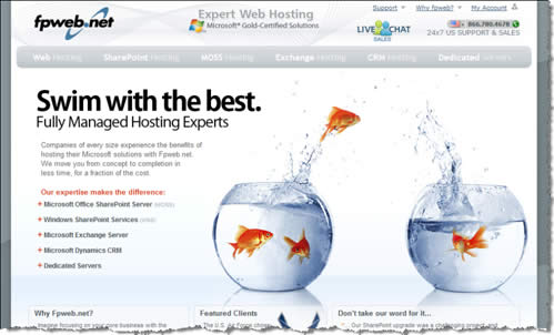
Analysis (Flint McGlaughlin)
- The images may be cute but they are too big. The font in the first paragraph is a problem; the light grey on white can hardly be read. It’s too small, has no bolding, and gets lost in the eye path.
Analysis (Jimmy Ellis)
- First of all, the image has to be of hosting and not of the fish. This is a branding headline that’s trying to make a mental connection that they are the best, it’s actually a web hosting program, but that combination is not doing anything for the customer.
- Move that last sentence in the copy paragraph – “We move you from cost to completion in less time for a fraction of the cost” – up to be the subhead.
- Answer the questions your customers ask, like: How much less time? What fraction of the cost? How are you going to save me the time and money by using your fully managed hosting solutions? Give some quantitative things that tell how your offering is going to benefit the consumer instead of this branding-based headline.